
Starting today and throughout April is National Autism Awareness/Acceptance Month! As far as I know, this campaign never had an official color; I have seen blue, green, yellow, and purple.
But in recent years, suggestions to avoid the color blue emerged, and it seems there is an ongoing effort to establish an official color for autism awareness/acceptance month—provided it’s not blue. But is it wise to abandon blue?
Light it up blue
Say what you will about Autism Speaks, but they are clever when it comes to marketing; with their campaign called Light It Up Blue, they have effectively claimed the color blue within the realm of autism campaigns.

As a result, a lot of people in the autism community refrain from using blue for awareness/acceptance month, as they don’t want to be associated with Autism Speaks, or be perceived as supporting what they stand for.
All of this is understandable considering Autism Speaks is infamous for having had some sinister views on autism—including believing autism to be a condition that ought to be eradicated.[1]I Am Autism commercial | Autism Speaks | YouTube Although they altered their mission statement in October 2016, many autistic people still prefer to distance themselves from the organization for various reasons, including poor autism representation and lack of inclusion of autistic voices in the organization itself.
Alternatives
In order to avoid the use of blue and the unwelcome associations, the autism community responded with three different counter movements:
- Tone It Down Taupe — Created in 2013 to introduce a color that symbolizes a more toned down approach to autism awareness, and taking autistic people’s sensory hypersensitivity into consideration.[2]Tone It Down Taupe | Facebook
- Light It Up Gold — As far as I gather this movement was created by the Âûtistic Union (after their initials AU, which is the chemical symbol for gold) in 2014.[3]Light It Up Gold | Facebook
- Red Instead — As far as I can trace the movement back, it seems to have been created by the Autistic Women & Nonbinary Network in 2016.[4]#REDinstead | Autistic Women & Nonbinary Network | Twitter
The Tone It Down Taupe movement seems to have been largely forgotten, but the latter two are often mentioned, and even recommended:
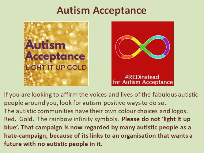
Looking at the image above, however, the gold reminds me of dazzle and glamor, and the red looks aggressive, and in combination with the infinity symbol, cult-like. Both present entirely the wrong connotations, and from a sensory perspective the red image is difficult for me to feel positive about. In fact, it is probably a testament to my powerful genes that I haven’t succumbed to a heart attack on account of the sensory terror I just had to process.
So gold and red in particular may not be ideal choices. Let me say a bit more about these color suggestions for National Autism Awareness/Acceptance Month.
Gold
Gold is metallic and thus has to be emulated, which makes it a very impractical choice for an autism awareness/acceptance campaign. In print and merchandise gold foil can be used which is expensive, or otherwise gold can be emulated by using murky yellow and gradients. It’s doable, but it might make participation unnecessarily complicated for some, because it takes a bit more skill or a bit more money to pull off.
Emulating gold with yellow may also be unwise on account of the general perceptions of yellow; a frequently cited study from 1994 indicates that yellow and green-yellow are considered to be the least pleasant,[5]Effects of color on emotions and personally I have seen this being confirmed often in various surveys on color preferences. As such, I don’t think representing autism acceptance campaigns with yellow is going to have the most positive influence on the public. If we want people to look at autism in a favorable light, perhaps we should avoid colors that are considered the least pleasant, or indeed any kind of metals that will necessarily be emulated with those colors.
Additionally, gold was already claimed for childhood cancer awareness in 1997.[6]The Gold Ribbon | International Childhood Cancer Day Although admittedly, there are a lot of causes, and only so many colors and metals one can select from, so some causes are bound to use the same campaign colors.
I shouldn’t be too hard on the gold movement, however. I have seen beautiful gold ribbons, as well as aesthetically pleasing digital images. When executed well, gold can indeed be quite powerful. It’s just not the most practical choice, and there is a greater risk of emulated images looking awkward, and as a campaign it is difficult to maintain cohesion between the different ways to emulate gold.
Recommendations to avoid blue aside, the color is sometimes used alongside gold—such as in the image below by North East Autism Society. This is not so strange from a color theory perspective, as blue is the polar opposite of orange/yellow, and as such is a wonderful complementary color to gold. But it may be an indication of how hard it can be to completely avoid the use of blue. And why would you?
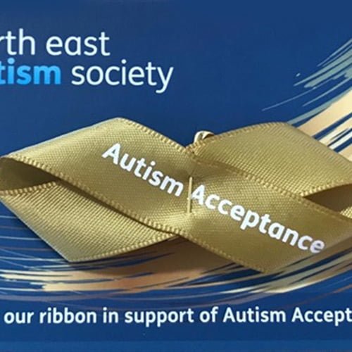
As you can see, gold and blue make for a powerful combo, and nothing about the gold ribbon or its general presentation on a blue background actually makes me think of Autism Speaks, nor does it seem likely that anyone would mistake this for being associated with them, or supporting what they stand for.
Red
As for red, according to InformeDesign, 85% of autistic children see colors more vividly, with red appearing nearly fluorescent and vibrating with intensity.*[7]Implications Vol. 06 Issue 04 | InformeDesign As such I think using red may be insensitive to autistic people. Although the study was not done on adults, I don’t know if the perception of colors is consistent as we grow older, but at the very least, using red for a campaign might have a negative influence on 85% of autistic children.
- 10% of autistic children see colors with the same intensity as neurotypicals, and 5% see muted colors.
I have seen complaints already even from autistic adults, who indicate that autism campaigns are becoming inaccessible for them on account of the red. Obviously, it is not wise to use a color that potentially excludes (some of) the very people you campaign for!
Also consider color theory, and the influences of colors on our psychology. In 1942 German neurologist and psychiatrist Kurt Goldstein posited that certain colors, like red and yellow, can produce negative arousal (i.e. negative emotional responses).[8]Some experimental observations concerning the influence of colors on the function of the organism However, they can also produce cognitive orientation (e.g. outward focus), and overt action (e.g. forceful behavior).[9]Some experimental observations concerning the influence of colors on the function of the organism
A study from 2009 demonstrated that red induces primarily an avoidance motivation (i.e. it deters), but also that red enhances performance on detail-oriented tasks, whereas blue enhances performance on creative tasks.[10]Blue or Red? Exploring the Effect of Color on Cognitive Task Performances
Regarding negative arousal and avoidance motivation, prime examples are to be found in traffic signs and construction, which predominantly uses red and yellow respectively; these colors tend to offer warnings, or promote certain actions (e.g. stop for a red light or a red stop sign). On the positive side then, red can indeed bring people into action, and is thus conducive for campaigns and rebellion.
However, based on our innate responses to red as well as our responses as a result of its cultural encodings (at least in the west), I would argue red is better for a protest campaign than an awareness and/or acceptance campaign. With the latter, you don’t want to produce negative arousal in others. And since autistic people may be particularly susceptible to this, I don’t think red is the right color for National Autism Awareness Month.
Additionally, according to a study from 2015 it was shown that red when worn by opponents—at least within the context of sports—were reported to produce a higher level of cognitive anxiety (whereas opponents in blue uniforms inspired self-confidence).[11]The effect of red and blue uniforms on competitive anxiety and self-confidence in virtual sports contests So the use of red may have a particularly negative effect to those who already see autistic people as opponents of sorts, or simply the (Constitutive) Other.
Taupe
Regarding the taupe campaign, I think taupe/tan/beige is indeed non-offensive and non-obtrusive, and is thus a sensible color for autism campaigns in the sense that it doesn’t tend to invoke such negative responses (consciously or subconsciously), but at the same time the color lacks force, and arguably makes things look bleak. Perhaps for these reasons I haven’t seen anyone suggest taupe this year.
I would also argue it’s hard to construct a good slogan around taupe. In particular, REDinstead is a powerful slogan for an anti-campaign, which opposes Autism Speaks’ Light It Up Blue campaign.
Monopoly on blue
But this is where I become quite concerned. Because is it actually wise to establish an autism acceptance campaign in opposition to Autism Speaks? I’m a bit concerned with an autism acceptance campaign being established to also function as an anti-campaign to Autism Speaks, although I have to admit it may very well be done out of necessity, because to use blue may now indeed be mistaken for supporting Autism Speaks.
It is quite astounding that the marketing efforts of one autism organization have been so successful—and so damaging—that it now constrains us in our color choices for autism representation. It is painful to admit that Autism Speaks might have a monopoly on the color blue—within the context of autism of course.
But I think to refrain from using blue is to admit Autism Speaks’ power over us. I am not sure what the best solution, but I don’t think gold and red are. Furthermore, the current suggestions to avoid blue at all costs I think are inadvertently doing damage, because I have noticed that some are taking it so far now as to discourage the use of blue within the context of autism altogether. As you can see from our website, that notion should concern us.
Blue speaks
What frustrates me is that in particular red is not chosen for its connotations being in harmony with autism, nor because red has any particular meaning in relation to autism, or any conducive influence that could be related to autism, but instead is simply chosen in opposition to Autism Speaks’ blue, because red happens to be just about the polar opposite of blue. So we are now establishing our autism identity in opposition to an organization, rather than basing it on attributes of autism.
As such, it feels very much like this is a campaign of opposition, rather than about awareness and acceptance. One might even argue that despite the harm Autism Speaks has done, when it comes to autism awareness and acceptance, it makes little sense to show so much contempt and aggression, and promote rivalry between autism organizations. Maybe the best way to go about this is to just ignore Autism Speaks’ efforts, rather than changing autism representation, not out of an inherent need, but in a desperate attempt to distance ourselves from that one organization National Autism Awareness Month was never about in the first place.
Reclaiming blue
Let’s not let Autism Speaks speak through our actions towards autism awareness and acceptance. Each time we state the alleged importance of establishing autism representation in opposition to Autism Speaks, we acknowledge its power. The best way to reduce that power is not by changing colors, because that inadvertently puts emphasis on Autism Speaks, and stigmatizes the use of blue. Instead, perhaps a better course of action is to stop mentioning Autism Speaks altogether. Why are we talking about this organization during or preceding National Autism Awareness Month? We are inadvertently giving Autism Speaks free publicity; negative as that publicity may be, it does further spread their name.
Yes, ironically I am doing exactly that. I suppose I am mentioning them by necessity now, to urge us to stop mentioning them in this context.
Maybe we should not avoid blue at all, but reclaim it. If the connotations of blue within the context of autism become significantly negative, and the color becomes deeply associated with Autism Speaks’ immoral attitudes towards autistic people at a societal level, then there may come a time for reappropriation, as blue is too wonderful to give up.
On that note, we chose blue as an essential part of our brand colors because the color is professional, calming, conducive to creativity, and instills a sense of quality and trustworthiness.[12]Color and psychological functioning: a review of theoretical and empirical work[13]Exciting red and competent blue: The importance of color in marketing
Some of the effects and connotations of blue seemed smart from a brand and marketing perspective, while others (such as trustworthiness) can easily be related to attributes of autism.
Besides that, through synesthesia-induced associations I have linked autism and blue with each other, so I couldn’t possibly adopt a different color to represent autism. My autism genes will not allow it!
Alternative
If we must use a different color to avoid associations with Autism Speaks, I think purple is a respectable choice. I think it is inoffensive as a color, yet still packs a punch. It’s not a widely used color per se, so it may be easier to claim for autism than red or gold. And funnily enough, purple could constitute a compromise between blue and red.
Is it actually the best color to represent autism? Not in our opinion, or we would have chosen different brand colors. As such, we must insist on blue. Not Autism Speaks blue, but Embrace Autism blue.
Combining blue and gold may be another wise choice. Let’s not give up on this lovely color just yet!
Cohesion
Lastly, I want to say that in order to make the most impact with a national autism campaign, we should probably come to some decisions on what the main color or colors should be, and what symbols should be utilized. The infinity symbol is a good symbol for neurodivergence and thus would work well for autism in combination with an autism-specific color. The use of puzzle pieces as symbols I would not recommend.
If we decide on colors and symbols and apply those systematically, we will get a lot more cohesion in our autism awareness/acceptance campaign. As such we will be perceived more as a diverse group of people united under one cause, instead of the rather disparate campaigns I have been seeing.

This post may be too late to influence your decisions this year, but hopefully, we will see a lot less red around the same time next year.
PS: If you have no idea why there are blue dogs in this post, you might need a clue.

Comments
Let us know what you think!